Optimizing mobile navigation menus in WordPress for high conversions involves streamlining menu items, positioning key buttons within natural thumb reach, and keeping collapsible menus fast and clean. By reducing clutter and highlighting a single primary call-to-action like ‘Buy Now’ or ‘Sign Up’, you guide visitors smoothly from browsing to taking action.
Why do mobile navigation menus affect your website conversion rates?
Your mobile navigation menu directly influences conversion rates because it acts as the main map of your website. If visitors using smartphones struggle to find what they are looking for due to cluttered links, tiny fonts, or slow-loading dropdowns, they will leave your site out of frustration before buying a product or filling out a contact form.
Imagine visiting a crowded physical store in Dhaka where all the aisle signs are written in microscopic text and stacked on top of each other. You would likely walk out without buying anything. The same rule applies to mobile websites. A clean, easy-to-use menu lowers user friction, keeps visitors engaged longer, and guides them naturally toward your conversion goals, such as making a purchase or signing up for a newsletter.
How can you audit and simplify your current mobile menu structure?
Auditing and simplifying your mobile menu requires cutting down your primary desktop links to a maximum of five to seven essential items. On a small mobile screen, overwhelming users with a mirror image of your giant desktop navigation creates cognitive overload and hurts conversions.
To audit your menu effectively, look at your website analytics using a tool like Google Analytics to see which pages mobile visitors actually visit. If a page gets almost no traffic, remove it from the main mobile menu or place it in the footer. Here is a simple framework to help you decide what stays and what goes:
- Keep: Home, Shop/Services, About, Contact, and a primary Call-to-Action (CTA) button.
- Move to Footer: Privacy policy, terms and conditions, old blog archives, and secondary social links.
- Consolidate: Group similar categories together under a single dropdown (e.g., combining ‘T-Shirts’, ‘Jeans’, and ‘Shoes’ under ‘Apparel’).
How do you design a thumb-friendly mobile menu layout in WordPress?
Designing a thumb-friendly mobile menu means placing interactive elements where a user’s thumb can easily reach them without awkward hand movements. Most smartphone users navigate their screens with one hand, usually relying on their right thumb.
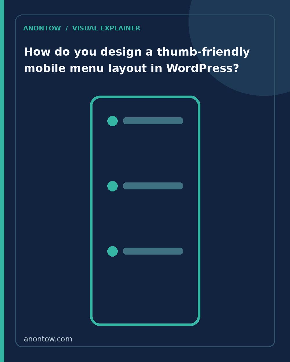
Placing your menu toggle icon (often called the ‘hamburger’ icon with three horizontal lines) at the top left corner of the screen forces users to stretch their hand awkwardly. Instead, consider these layout strategies:
- Bottom Navigation Bar: Position a fixed menu bar at the bottom of the mobile screen containing critical shortcuts like Home, Search, Cart, and a prominent CTA button.
- Thumb Zone Priority: Place your most important conversion action—such as ‘Order Now’—near the bottom or right side of the collapsible menu panel where fingers rest naturally.
- Generous Touch Targets: Ensure every link and button has a minimum height and width of 48×48 pixels so users never tap the wrong link by mistake.
What WordPress tools and plugins help build high-converting mobile menus?
You can build high-converting mobile menus in WordPress using either your theme’s native site editor, page builders like Elementor, or dedicated menu plugins. The best choice depends on your technical comfort level and how much control you need over animations and styling.
Here is a comparison of popular approaches for WordPress users:
| Tool Type | Examples | Best For | Trade-offs |
|---|---|---|---|
| Block Theme Navigation | WordPress Site Editor (Twenty Twenty-Four, etc.) | Clean, lightweight sites using modern WordPress blocks. | Limited advanced styling options without custom CSS. |
| Page Builder Menus | Elementor Pro, Divi | Completely custom mobile headers and visual designers. | Can slow down site speed if not optimized properly. |
| Dedicated Menu Plugins | Max Mega Menu, WP Mobile Menu | Adding advanced off-canvas drawers and search bars. | Another plugin to maintain and update regularly. |
How can you test and verify your mobile menu performance?
Testing and verifying your mobile menu performance involves physically interacting with your site on multiple actual smartphones and running technical speed audits. Never rely solely on desktop browser device emulation, because real touchscreens behave differently.
Follow these practical steps to test your new mobile menu:
- Open your WordPress site on an actual Android phone and an iPhone to check for layout bugs.
- Test the menu using only one hand to see if you can comfortably reach the toggle button and sub-links.
- Check your site speed using Google PageSpeed Insights to ensure your mobile menu scripts and icons are not slowing down page load times.
- Ask a friend or family member who has not seen your website to complete a specific task, like finding a product category, while you observe where they hesitate or struggle.
By keeping your mobile navigation clean, fast, and easy to reach, you remove invisible barriers that stop visitors from converting. Small improvements to mobile usability compound over time, leading to higher engagement and better business results for your WordPress site.
Frequently Asked Questions
How many items should be in a mobile menu?
Keep your mobile menu to a maximum of five to seven core items. Too many choices overwhelm users on small screens and lower conversion rates.
What is a thumb-friendly navigation zone?
The thumb-friendly zone, or natural thumb reach, is the bottom or lower-middle area of a smartphone screen where a user's thumb rests most comfortably while holding a device one-handed.
Do I need a plugin to customize my WordPress mobile menu?
While modern block themes and plugins like Elementor offer built-in mobile menu builders, specialized plugins like Max Mega Menu can give you advanced layout and styling controls if your default theme is limited.




Leave a Reply
You must be logged in to post a comment.